We may earn money or products from the companies mentioned in this post.
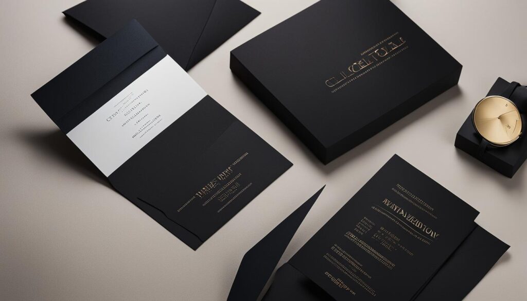
When it comes to creating visually stunning invitations, typography plays a pivotal role in setting the tone and style of your design. With so many fonts and styles to choose from, it can be challenging to know where to start. In this section, we will explore some invitation typography tips to help you elevate your event design and leave a lasting impression on your guests.
Key Takeaways:
- Invitation typography plays a vital role in creating visually stunning invitations.
- Choosing the right fonts and arranging them effectively is essential to creating harmonious designs.
- Staying up-to-date with the latest typography trends can help you create designs that stand out.
- Effective font pairing can help match the theme and tone of your event invitations.
- Arranging fonts in a visually appealing way can help enhance the overall aesthetic of your design.
Understanding Invitation Typography
Typography is the art and technique of arranging type to make written language legible, readable, and appealing when displayed. In invitation design, typography is crucial in conveying the theme and tone of the event. Understanding the best practices for typography is essential for creating a visually appealing and impactful design.
Typography for Invitations
When choosing typography for invitations, it’s essential to consider legibility and hierarchy. Legibility refers to the ease with which a reader can distinguish one letter from another. Hierarchy is the arrangement of elements in order of importance. When designing invitations, it’s crucial to have a clear hierarchy to guide the reader’s eye to the most important information first.
Best Typography Practices
When it comes to typography for invitations, there are a few best practices to keep in mind. Firstly, it’s best to limit the number of font families used in a design to avoid visual clutter. Secondly, pay attention to the contrast between the font and the background. A high contrast ensures readability and legibility. Finally, consider the size of the font and how it will appear on different devices and screen sizes.
Choosing Fonts for Invitations
The font selection is crucial in setting the tone and mood of the invitation. When choosing fonts, it’s essential to consider the event’s theme and the target audience. Formal events like weddings and corporate events call for traditional serif fonts, while casual events like birthdays and baby showers can benefit from playful and whimsical fonts. It’s also crucial to choose fonts that are easy to read, even at small sizes.
| Type of Event | Recommended Font Pairings |
|---|---|
| Weddings | Times New Roman and Bodoni |
| Baby Showers | Chalkduster and Brush Script |
| Birthday Parties | Comic Sans MS and Impact |
Conclusion
Choosing the right typography for your invitation design can make all the difference in creating an impactful and visually appealing design. By keeping in mind legibility, hierarchy, and font selection, you can ensure that your invitations convey the right tone and mood for your event.
Choosing Fonts for Invitations
When creating invitations, choosing the right fonts can make all the difference in setting the right tone and conveying the desired message. Here are some tips for selecting the perfect fonts for your invitations.
Consider the Theme and Tone
The first step in choosing fonts for your invitations is to consider the theme and tone of your event. For example, a formal wedding invitation may require elegant and traditional fonts, while a more casual party invitation may call for playful and modern fonts.
You can also experiment with font pairings to create a more dynamic and interesting look. A classic serif font paired with a modern sans-serif font can create a stylish and sophisticated contrast.
Stay Up-to-Date with Trends
Invitation typography trends are constantly evolving, so it’s important to stay up-to-date with the latest styles. Currently, some popular invitation font trends include:
- Handwritten and script fonts for a personal touch
- Geometric and minimalist fonts for a modern look
- Vintage and retro fonts for a nostalgic vibe
Remember to choose fonts that not only look stylish but are also legible and easy to read.
Sample Font Pairings
| Event Type | Font Pairing |
|---|---|
| Formal Wedding | Playfair Display and Montserrat |
| Modern Party | Helvetica Neue and Futura |
| Vintage Baby Shower | Great Vibes and Lato |
These are just a few examples of popular font pairings for different types of events. Don’t be afraid to experiment and find your own unique combinations!
By choosing the right fonts and pairings, you can create stunning invitations that leave a lasting impression on your guests.
Arranging Fonts for Visual Impact
Typography is not just about selecting the right fonts; it’s also about arranging them in a visually appealing way. When done correctly, typography can enhance the overall composition of your invitation design and make it stand out. Here are some tips for arranging fonts:
- Establish hierarchy: Assign different font sizes and weights to different elements of your invitation, such as the event name, date, and location, to create a clear hierarchy of information. This will help guide the reader’s eye and prevent them from getting overwhelmed with information.
- Mind your spacing: Ensure that there is enough space between the lines and letters of your text for easy readability. Tight spacing can make the text difficult to read, while too much space can make it look disconnected. A good rule of thumb is to have a line spacing that is 1.5 times the font size.
- Align carefully: Align your text elements carefully for a neat and polished look. The alignment can be left, right, center, or justified, depending on your design aesthetic. However, be consistent with your alignment throughout the design.
- Experiment with layout: Don’t be afraid to experiment with different layouts to see what works best for your design. Try out different combinations of font sizes, weights, and alignments until you find the perfect balance.
When arranging fonts, keep in mind that less is often more. Avoid cluttering your design with too many fonts or styles, as this can make it confusing and hard to read. Stick to a few carefully selected fonts and arrange them in a way that enhances the overall design aesthetic of your invitation.
“Typography is the voice of your design. No matter how good your images are, your design is only as good as your typography.”
Remember, typography is an art form, and there is no right or wrong way to do it. Gain inspiration from real-life invitation designs and experiment with different typography choices to find what works best for you. With practice and patience, you’ll soon master the art of arranging fonts for visual impact and create stunning invitation designs that will leave a lasting impression on your guests.
Conclusion
Typography is a critical element in creating visually stunning invitations that leave a lasting impression on guests. By applying the best practices in typography, choosing the right fonts, and arranging them effectively, you can elevate your event design to the next level.
Remember to keep experimenting and stay up-to-date with the latest invitation typography trends to create designs that stand out. Applying the principles of hierarchy, spacing, and alignment will ensure that your typography choices enhance the overall composition of your invitation design.
Whether you’re designing for a wedding, party, or corporate event, choosing the right typography can make all the difference in creating memorable invitations that reflect the tone and theme of the occasion.
FAQ
Why is typography important in invitation design?
Typography plays a crucial role in creating visually stunning invitations. The right font selection, arrangement, and staying up-to-date with the latest trends can enhance the overall aesthetic and leave a lasting impression on your guests.
What are the best practices for typography in invitation design?
When it comes to typography, it’s essential to consider font selection, hierarchy, and legibility. By following these best practices, you can ensure that your invitations are visually appealing and easy to read.
How do I choose the right fonts for my invitations?
Selecting fonts that match the theme and tone of your event is crucial. Explore popular font pairings for different types of events and stay updated with the latest typography trends to create designs that stand out.
How can I arrange fonts for visual impact in my invitation designs?
Techniques such as hierarchy, spacing, and alignment can help create visual impact in your invitation designs. Gain inspiration from real-life invitation designs and apply these principles to enhance the overall composition of your invitations.
What role does typography play in creating memorable invitations?
Typography plays a significant role in creating memorable invitations. By understanding the best practices, choosing the right fonts, and arranging them effectively, you can elevate your event design and leave a lasting impression on your guests.
Affiliate Disclosure: This post may contain affiliate links. If you purchase through our link, we may receive a small commission, but at no additional cost to you. For more information, please see our Disclosure statement.


